WePlay App (UX/UI)
The Challenge
Ironhack Design Bootcamp final solo project was to choose an industry, find a problem space and create an app in 2 weeks to solve that problem at hand.
As a sport passionate I decided to dig into sports and find;
What do sport-lovers need?
MY ROLE
UX/UI DESIGNER
DISCOVERY AND RESEARH
Qualitative - Interview’s
I first interviewed 8 people that I know are sport passionate to find out what were their habits. They also told me that…
6/8 “ I prefer to work out Monday to Friday”
5/8 “I train after work, late at night”
8/8 “ I do sport to keep fit”
5/8 “ Don’t know people with the same sport level.”
6/8 “ Don’t mind the age when playing with someone but the level so that they don’t feel they’re wasting their time.”
After gathering all the findings I built an affinity diagram so that I could cluster all the given data by patterns and relations.
From all the topics on the table, I decided to tackle the following:
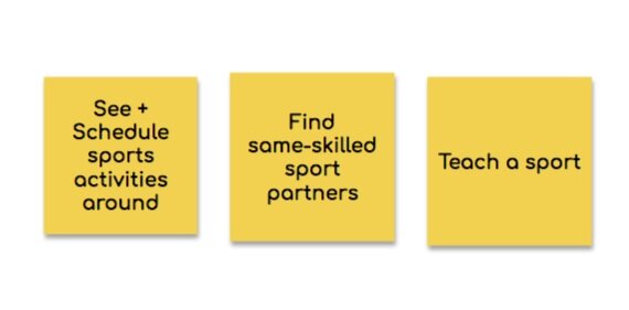
Sport partnering, Availability to meet and Learning sports.
Quantitative- Survey
After having some idea of what the main pain points were and understanding a bit of the mindset of sports passionates I surveyed 60 people and found out that:
80% people prefer to play sports Monday-Friday
63% prefer to play with people with similar skills level
50% don’t know people that play/practice their same sport
PROBLEM STATEMENT AND TARGET USERS
Problem statement
“People who love sports
need to find a way to connect with others with similar sport skills
because they like sharing their passion”
And who could be having this problem?
User Persona
I then defined Mark as my user persona;
To better understand Mark’s feelings, thoughts and goals I developed this journey regarding “Playing tennis after work” to see possible touch points were I could improve the journey.
Customer Journey
based on this journey I discovered that the main pain points were; finding someone to play with with and not only that, finding someone with the same level of expertise so that he didn’t feel as he was wasting his time.
IDEATION
Having this in mind I started my competitive analysis to see what I could learn from them and also what features could be interesting to then come up with 3 main features for my product.
COMPETITIVE ANALYSIS
FEATURE PRIORITIZATION
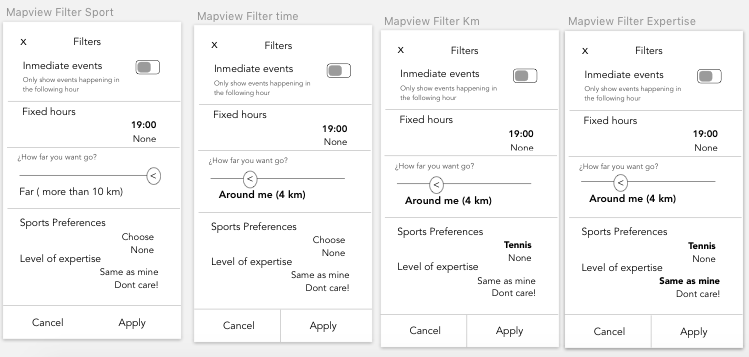
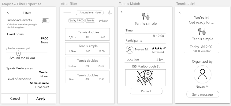
With this top 3 features in mind, I started prototyping;
PROTOTYPING
Low Fi Prototype
TEST AND ITERATE
Key takeaways
After testing the prototype with 5 users I discovered I had to solve 3 main aspects:
Map view missing info
Improve commitment aspect
Improve reliability in terms of the level of expertise by including rating between players after every match
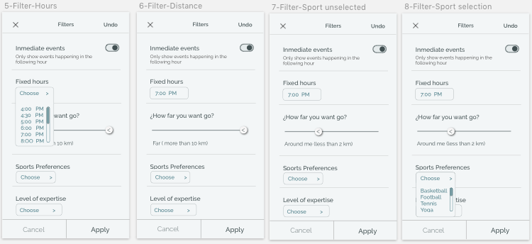
HIGH FIDELITY PROTOTYPE
After testing and solving the issues with my first approach, I designed the UI now in High definition;
FUTURE STEPS: MONETIZE
For the future and in order to monetize the app. I would like to test a premium version of it, giving “ expert-users” the possibility to teach and any user to learn from them.
Many thanks for your time!! ❤


